The Aesthetics of Science Fiction. What does SciFi Look Like After Cyberpunk?
By Rick Liebling
medium.com
A cursory glance of the Adjacent Possible tumblr feed or Pinterest board will tell you that recently I’ve been obsessed with ideas around the aesthetics of science fiction. More specifically, I’ve been thinking about what science fiction looks like beyond the prevailing design aesthetic of the past 35+ years — Cyberpunk. The following is the first of a two-part series I’m calling The Aesthetics of Science Fiction.

The Lecture Centre of Brunel University London, designed by Richard Sheppard in 1968
In this first piece my focus will be on architectural design. I’ve got some theories, but I’m certainly not an expert in this area. As such, I’ve reached out to several people who are experts, and asked for their thoughts and expertise in this area. In some cases their ideas run similar, one might say adjacent, to mine, and in other instances their knowledge leads them to conclusions that run in other directions. My objective here is to open a discussion more than produce a manifest. I hope you’ll enjoy this excursion and at the very least, find the thoughts and concepts put forth by these experts to be highly illuminating. I certainly did.

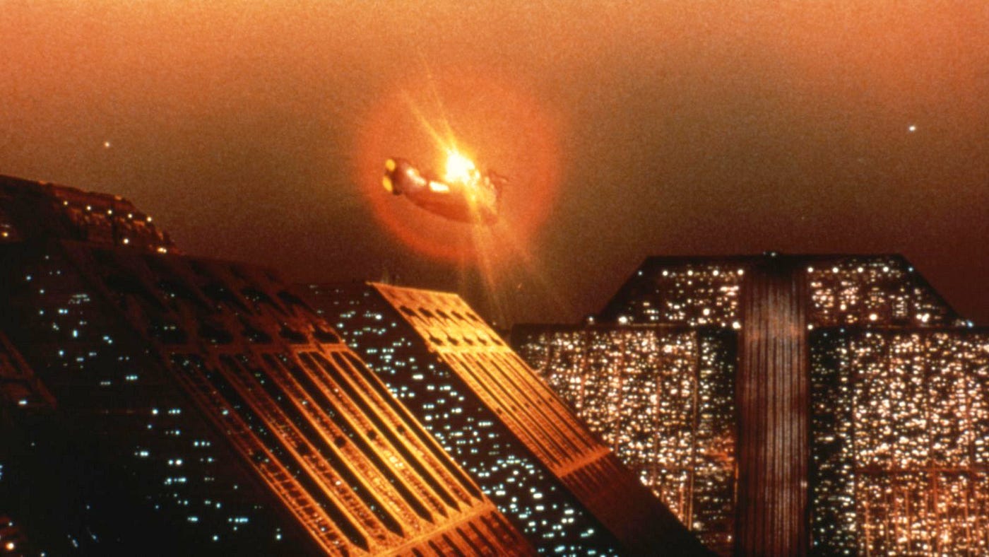
A spinner heads towards the Tyrell Corp. headquarters in Blade Runner (1982)
While the term Cyberpunk has its literary origins in the works of modern masters such as William Gibson, Rudy Rucker, Bruce Sterling and Pat Cadigan, mention the “look” of Cyberpunk and the Ridley Scott film, Blade Runner (1982), is almost always the example put forth. The visual shorthand established in that film — dark, rainy, urban landscapes — were to some degree a callback to film noir, but updated with an abundance of neon signs and and a multicultural street life. By the end of the decade, Japanese manga, especially the popular Akira and Ghost in the Shell titles, gave the Cyberpunk look a global presence.
Of course the Cyberpunk look was a product of the times. Mixing rebellious youth culture (punk) with advancing technology (personal computers, the Walkman), the explosion of capitalism (exemplified by Wall Street’s ‘Greed is Good’ maxim) and the lingering skepticism of the military-industrial complex, the late-70s and early-80s were a deeply cynical time that called for a visual identity to match.

Buck Rogers (1939)
Cyberpunk’s three decade+ hold on the visual identity of the genre is not dissimilar in its duration from the signature science fiction look that came before it. As any fan of Mystery Science Theater 3000 can tell you, the colorful, military-inspired uniforms of Buck Rodgers and Flash Gordon, along with shiny metallic jumpsuits were a staple of the genre for a good thirty years. The Atomic Age and Space Age ushered in a vision of the future that was clean, crisp and bright.
In 1968 Stanley Kubrick shook up the genre with 2001, a modern look that kept much of the clean space age look, but married it with the realities of NASA (the U.S. would put a man on the moon one year after the film’s release. Related - see this brilliant breakdown of the typographical design elements of 2001).
Less than a decade later, Star Wars would reshape the science fiction landscape, and generate many copycats, but the Star Wars Universe is more rooted in fantasy (and Westerns and Samurai films) than in hard science fiction, and so while Star Wars has an out-sized place in the history of the genre, I don’t know that it has had the same cultural impact from a visual perspective as Cyberpunk.
But now, some three decades-plus since we first “saw” Cyberpunk, what do we have now? Is there a unifying visual idea that we associate with modern (2000 and beyond) science fiction? I’ve noticed over the last decade or so that there are some recurring themes. Perhaps not exclusive to science fiction - in the same way that the Cyberpunk aesthetic wasn’t exclusive to science fiction (see: Black Rain) - but that I’ve seen recurring in genre work.
I call it Hard Concrete.
Like Cyberpunk and Atomic Age &Space Age design before it, Hard Concrete is linked to the realities of the times. If Cyberpunk was the visual embodiment of the corporation as mysterious behemoth, Hard Concrete parallels a world where corporations and governments have been exposed as brutal, uncaring and stripped of their shiny, mirror-glass facades. They may be no less controlling, violent or malevolent, they just no longer bother to hide it.
Author and historian James Gleick in his book Time Travel (p. 305) touches on this evolution of the design aesthetics that have influenced science fiction:
“The aesthetic of futurism changed, too, without anyone issuing a manifesto — from big and bold, primary colors and metallic shine to grim, dank rot and ruins.”
This may not align exactly with my view, but it does suggest Gleick is seeing an evolution similar to the one I’m examining. Let me walk you through some examples:
In the future created by Lisa Joy and Jonathan Nolan in their re-imagining of Michael Crichton’s Westworld, here are the underground labs where Hosts are manufactured:

Westworld (2016)
Singer and actress Janelle Monae’s Dirty Computer, an “eMotion picture” to support her most recent album:

Dirty Computer, Janelle Monae (2018)
James Cameron could have had any set he wanted for his AMC series, James Cameron’s Story of Science Fiction. This is what he chose:
James Cameron and Steven Spielberg filming a segment for James Cameron’s Story of Science Fiction.
In all these cases we see a de-saturated view of the world, no longer neon on black, just a pall gray. Gone is the “Coolness” of Cyberpunk, now replaced by the “coolness” of a color palate that ranges from a flat blue to an olive drab with only slightly less than 50 shades of gray in between.
Also gone is the slick polish found in Cyberpunk — the Mirror’s Edge videogame comes to mind. It’s replaced now with a raw, unfinished look.
Just as Cyberpunk called back to an earlier visual grammar — the noir film — Hard Concrete also looks back for certain design cues, namely Brutalist architecture. Look at these images of structures built 50–60 years ago and tell me they wouldn’t fit in the next installment of the Alien franchise, or as the above ground edifice to the host laboratories on Westworld.

Saint-Pierre Church, Firminy (France), Design — 1971
I reached out to Luke Jones, who along with George Gingell does the brilliant About Buildings + Cities podcast. Luke and George have done episodes on both William Gibson’s Sprawl Trilogy and the worlds of Blade Runner and Blade Runner 2049. I proposed my Hard Concrete idea to them and Luke responded:
In a sense, that sort of crisp, board marked concrete has acquired the ‘monumental’ feeling which stone or plasterwork might have had previously. It is the material of mid-century office blocks, cultural facilities, government offices, university libraries etc., and as such has gained a sort of seriousness or solemnity. It’s not exactly ‘traditional’ but it has started to imply an architecture of established authority and respectability in a certain way.”
Teresa Carreño Cultural Complex (Venezuela) Design — Early 1970s
I think, for me, what’s makes this interesting is that while the Brutalist architecture was, as Luke states, built for government organizations, and in viewing its use as a science fiction aesthetic it fulfills the same role, what’s happened in between the 1960s and today infuses the look with a different meaning. We’ve seen governments and corporations “try on” the looks of sleek, modern, futuristic architecture. It felt good in the 80s, in the wake of the moon landing, personal computers, Tron, and the like. But now, in 2018, the present, and therefore the representation of the future, doesn’t seem so shiny anymore.
Of course, even the original Cyberpunk design took its cues from previous eras. Again, Luke Jones from Buildings + Cities…
It’s worth remembering that many of those original cyberpunk interiors were already ‘old’ in the sense that they imagined these new technologies being layered onto an older, still existing city. The city of Blade Runner is much more influenced by the aesthetics of 1900–30s skyscrapers than those of the 1960s. So in a sense it’s natural that it’s moved on, while still looking backwards for inspiration.
And so why the return to Brutalist style today? Jones:
The futurism of the 1960s probably seems like a kind of neutral ‘futuristic’ quality now. It was an era when the transformation of the city through technology and infrastructure was much more of a fascination (and much more visible) that it has been since. It’s still a natural sourcebook to turn to.
As a material, concrete gives life to our relationship with power structures, especially as depicted in science fiction. It is at once transparent — a sort of “nothing to hide here” transparency — while also being opaque and impenetrable. This at a time when our government and corporate power brokers seem to have thrown off the pretense of even trying to pretend they work for us, while simultaneously girding themselves against resistance from the public.
The blog Eternal Opinion of My Spotless Mind, in a post entitled, Brutal, Brutalist Science Fiction and the Ties to Archigram, explains the thematic power of Brutalist architecture in science fiction as expressed in the film Equilibrium (2002):

Equilibrium (2002)
In this film, the image of the overpowering government relies on the visual separation of the individual. Because of this, the city’s citizens and figure heads wear primarily shades of white and black (a few throughout the film wear colored clothing, but to accentuate the importance of their actions to the viewer) in order to sustain common peace. But not only the people of the city abide by these regulations; the city itself does as well by maintaining an almost repetitive beauty of massive concrete aesthetics.
To be clear, I’m not suggesting that Brutalist architecture and science fiction is a new pairing. In this video on Brutalist architecture from ARTiculations, the usage of iconic Brutalist buildings in science fiction dating back to Stanley Kubrick’s A Clockwork Orange is showcased.
My main contention is that we’re seeing Cyberpunk, after a 30+ year reign, give way to a new look, which I’ve dubbed Hard Concrete, that takes many of its cues from Brutalist architecture.
David Fortin is the Director at the McEwen School of Architecture, Laurentian University in Ontario, Canada. In addition, he’s written the book, Architecture and Science-Fiction Film: Philip K. Dick and the Spectacle of Home. When I reached out to him regarding the idea of Hard Concrete, he responded with the following:
I believe the imagination of science fiction has adopted this aesthetic for a few primary reasons. The first is it implies time by its permanence. The curved plastic of futures past became easily linked to a specific time period of future thinking and so it could more easily be translated into a style, now what many call retro-futurism. Same with shiny metallic clothing and flying cars, etc.
While I had keyed in on Brutalism’s timelessness, Fortin also sees another facet that I hadn’t considered:
But I think, as importantly, concrete is ultimately placeless. No culture can claim concrete as a vernacular building tradition. This is crucial for futuristic imagery if the director doesn’t want the audience to be feeling any baggage associated with a certain place or cultural group — like the international style, it attempts to unify.
Fortin then connects the dots, explaining the emotional impact of Hard Concrete better than I could:
I think the Hard Concrete also performs like a frame of the human condition through its materiality. Many sci-fi narratives are ultimately questioning our humanity in a speculative way, including our relationship with technology, our social evolutions and devolutions, etc. The blank concrete surfaces are most often in stark contrast to the human figures and their interactions. There is not a human scale to this material. In fact, it doesn’t really have a scale. Thus it does not relate characters to the natural world or themselves.
In fact, the concrete is not warm or inviting to the human senses in any way when isolated as a material (or when combined with metal and glass). I feel these environments ultimately make a critique of our current trajectory in terms of our detached relationship to the natural world, through the choice of such materials. Without artifacts, decor, or materials that offer an indication of time (as opposed to films like Blade Runner where the intent is the opposite, to confuse time through a postmodern collage of mixed imagery), the blank surfaces, in my opinion, are a strategy to remove time and place from the equation, which has the capacity to estrange the viewer. Even though much contemporary design has ended up in similar places, for now, there is still a significant spatial and material disconnect from the day-to-day experience of the average movie-goer….
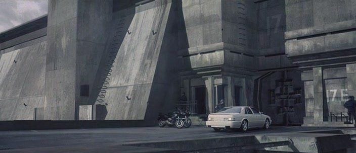
Ok, that last part is a lot to dig through. Let’s dive into “Without artifacts, decor, or materials that offer an indication of time…” Take a look at this image of a police station from the the Netflix original film, Anon (2018):

Anon (2018)
And now, “the blank surfaces, in my opinion, are a strategy to remove time and place from the equation…” Here’s a still from The Dark Knight. Not technically a sci-fi film, but look at this shot of Wayne’s workshop and it could be from 1978, 2008, or 2028:

The Dark Knight (2008)
An architect (and budding science fiction author) I know quite well, Jeff Liebling, had a similar take. Read the following and consider again the image from Anon above:
“…[T]hey are all cold and distant and almost inhuman; and therefore can stand in for otherworldly or alien. They are mostly not of human scale and therefore dehumanizing at least to some extent. Architectural spaces are broken down to human scale by the articulation of details such as doors that imply human height, window mullions that break up huge expanses of glass, furnishings, etc.”
You might be familiar with Kate Wagner from her biting and masterfully on-point critiques of residential architecture run amok, McMansion Hell. Her expertise however goes beyond identifying extraneous dormers and superfluous eaves. She took a deep dive into the look of science fiction in a piece entitled, The Architecture of Evil: Dystopian Megacorps in Speculative Fiction Films for the website 99% Invisible.
In speaking with her, she offered the following on the look of Cyberpunk and its orgins:
“I think for Cyberpunk (if we’re talking about the sub-genre that ostensibly originated with Neuromancer), the neon-and-rain aesthetic is partially tied to the time the genre was created. The early/mid-1980s had one foot in the architecture of High Tech (e.g. the Pompidou Center) and one foot in Postmodernism (e.g. Portland Building; Memphis Milano).
High Tech architecture was entrenched in Late Modern ideas of hyper-technological expression. In the words of theorist Charles Jencks, Late Modernism was “pragmatic rather than idealist, and ultra-modern in its exaggeration of several modern aspects — extreme logic, extreme circulatory and mechanical emphasis, a mannered and decorative use of technology, a complication of the international style…and an abstract rather than conventional language of form…” (Late Modern Architecture, page 13).”
This then manifests itself in Cyberpunk, the defining science fiction sub-genre of the era. Wagner continues…
Part of Postmodernism in architecture was a reaction against all of this technologically fetishized architecture of the 60s and 70s, and arguably in literature, Cyberpunk falls into this category, as it is inherently critical of technology and the effects it can have on society and interpersonal relationships. Thus the aesthetic of Gibson-era Cyberpunk is one of hyper-exaggeration of the applications of technology in architecture, seen through the lens of a very specific time period.
So, how does our current culture push post-Cyberpunk science fiction design and architecture, and at the same time bring them together to form a new visual and textual grammar? Wagner again…
In current cyberpunk works, the minimalist aesthetic comes from a renegotiation of today’s aesthetics of architectural modernism and contemporary technology, rather than those of the 1980s. In our current eyes,

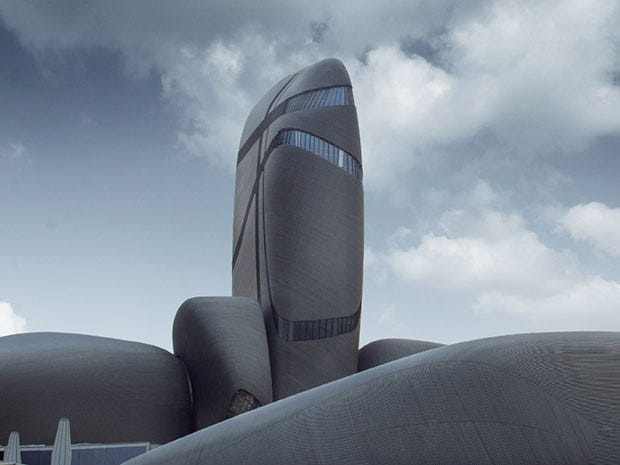
The King Abdulaziz Center for World Culture by Snøhetta.
technological hell looks more like the sparse architecture of Snohetta or the hyper-articulated work of Zaha Hadid. Instead of green-and-black text on computer terminals, the technology that will come to imperil us takes the Black Mirror approach: our ordinary phones, or the sleekness of a MacBook Pro. As for the resurgence of Brutalism, it’s not so much old-school brutalism but current architects (like Peter Zumthor, for example) re-imagining the use of visually weighty materials such as stone and concrete, but through today’s heavily streamlined and minimalist aesthetic, rather than the heroic, monumental approach of Brutalism.

Thermal baths in Vals, Switzerland by Peter Zumthor.
Zumthor especially negotiates elements like natural light in such a way that the building does the work of setting a specific mood, which leads to a more muted light and color palette than the neon lights of yore. When the geometry of a space and the texture of materials (e.g. concrete walls) is the main visual element, a space must be sparsely decorated in order to maintain the visual dominance of the architecture; this also can be used to the effect of leaving the viewer feeling isolated or trapped, which is why it is so effective in contemporary science fiction. However, I think that there is an extent to which contemporary science fiction (e.g. Blade Runner 2049) where Brutalist elements are recalled in order to pay homage to the genre’s visual predecessors.
Suggested further reading: Futurism has a collection of 60 short science fiction stories (500 words or less) called, Brutalist Stories. Each story is inspired by a work of Brutalist architecture.
In part two of this series on the aesthetics of science fiction I’m going to take a look at the apparel and gear of modern science fiction, but I do want to touch on it here as a bit of a teaser because Cyberpunk has been so influential in this area as well.
The ‘heroes’ of Hard Concrete no longer don black leather jackets and mirrorshades, their enhancements aren’t nearly as sleek and their environments have retreated from the cold ones and zeros of cyberspace to the reality of a world descending into chaos.
Consider this still from Johnny Mnemonic (1995), based on the William Gibson story:

Now compare that to the Neil Blomkamp film, Elysium (2013)…

Matt Damon in Elysium. 50 Shades of Gray indeed.
Thanks for reading. If you liked this piece and are interested in the convergence of science fiction, technology, science and innovation, please consider subscribing to the Adjacent Possible newsletter.